| Dec 29, 2016
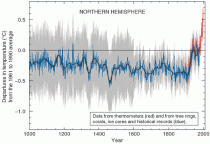
By Francis Menton Scott Adams—known, among other things, as the cartoonist behind the Dilbert series—has an excellent blog on which he posts something thoughtful nearly every day. His particular interest is in the arts of persuasion. Recently he has dipped his toe into the subject of “climate science,” with a focus on the apparent inability of partisans on either side of the debate ever to convince a single person to come over from the other side. Now, suppose you come to this debate with no scientific expertise and no ax to grind for either side. The debate has very significant public policy implications, and understanding it is important to being an informed voter. How are you to supposed to evaluate the arguments and come to a view? Adams comments: My bottom-line belief about climate science is that non-scientists such as myself have no reliable way to evaluate any of this stuff. Our brains and experience are not up to the task. When I apply my tiny brain to sniffing out the truth about climate science I see rock-solid arguments on both sides of the debate. I’m going to respectfully disagree with Adams on this one. If you are a reasonably intelligent person, and you are willing to spend a few hours on an issue, there is a very workable method to discern which side of a debate is not playing straight with you. This method is the same method generally used by judges and juries in deciding which side is going to win a trial. The method is this: look to which side has and provides the best answers to the hard questions posed by the other side. If one side refuses to answer hard questions, or is evasive, or refuses to provide the underlying methodology by which it came up with its answers, then that side has a problem. And rightfully so. I’ll give just a few examples of this phenomenon relevant to the climate change issue. (1) The Hockey Stick graph. The so-called Hockey Stick graph first appeared in a paper by Mann, Bradley and Hughes that was published in Nature magazine in 1998. It purported to show a reconstruction of worldwide temperatures from the year 1000 to present, in which the temperatures had remained almost completely stable for the first 900 years (the “shaft” of the Hockey Stick), and then suddenly shot up in the twentieth century in the time of human CO2 emissions (the “blade"). This reconstruction effectively repealed the prior accepted version of climate history, in which temperatures had been warmer than the present at least in the so-called Medieval Warm Period of about 1000 - 1300, and probably also in the Roman Warm Period around the year 0. When the UN’s climate-evaluation body, the IPCC, issued its next Assessment Report in 2001, the Hockey Stick graph had suddenly become the icon of the whole endeavor, appearing multiple times in the Report. The Hockey Stick seemed like the perfect proof of the proposition that global warming must be caused by humans, because anyone could see from the graph that the warming had all occurred in the era of human use of fossil fuels. Here is a version of the Hockey Stick graph from the IPCC Third Assessment Report:
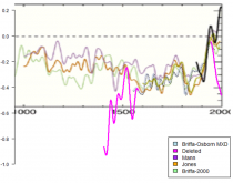
Unfortunately for Mann et al. and the IPCC, numerous people—those nefarious “skeptics” --promptly began to ask questions about the source of the information behind the “shaft” of the stick. Thus these skeptics were questioning the ideas that temperatures had remained essentially stable for a millennium and that there had been no Medieval Warm Period. The most famous of the skeptical researchers was a Canadian named Stephen McIntyre. McIntyre began a blog called Climate Audit, and started writing many long posts about his efforts, all unsuccessful, to replicate the Mann et al. work. Requests to Mann et al. for their data and methodologies were met with hostility and evasion. Over time, McIntyre gradually established that Mann et al. had adopted a complex methodology that selectively emphasized certain temperature proxies over others in order to reverse-engineer the “shaft” of the stick to get a pre-determined desired outcome. The coup de grace for the Hockey Stick graph came with the so-called Climategate emails, released in 2009. These were emails between and among many of the main promoters of the climate scare (dubbed by McIntyre the “Hockey Team"). Included in the Climategate releases were emails relating specifically to the methodology of how the graph was created. From the emails, skeptical researchers were then able to identify some of the precise data series that had been used by Mann et al. Astoundingly, they discovered that the graph’s creators had truncated inconvenient data in order to get the desired depiction. A website called Just the Facts has a detailed recounting of how this was uncovered. As a key example, consider this graph:
The bright pink represents data that was deleted from the Mann et al. reconstruction because, obviously, it would have thrown off the nice, flat “shaft” of the stick, while also revealing that this particular “proxy” had totally failed at predicting the twentieth century rise in temperatures. Most would call this kind of data truncation “scientific fraud.” Note that the revelations that came out of the Hockey Stick controversy do not prove that the human-caused global warming hypothesis is wrong. However, those revelations did show beyond doubt that the leading promoters of the hypothesis had resorted to fraud in the effort to get the public to accept their position. Once that was established, why would you believe anything else they say? Even today, the Wikipedia write-up of the Hockey Stick controversy takes a position favorable to Mann et al. If you are willing to devote some time to this issue, read that article next to the write-up at Just the Facts linked above. I would call the Wikipedia article evasive in the face of highly credible allegations of fraud. See if you agree. (2) Adjustments to the instrumental temperature record. World temperature records based on ground-based thermometers date back to about the late 19th century in most cases. These records are far more accurate than what we have from earlier times (which are mostly “proxies,” like tree rings and ice cores); but the ground thermometer records still have plenty of problems. As examples, the location of a ground station could have been moved over time, sometimes multiple times in over 100 years; the physical surroundings of a station could have changed (trees could have grown up, or an adjacent parking lot could have been built); the type of instrument could have changed; and so forth. Most would agree that some sorts of adjustments to the record, known as “homogenization,” are appropriate to make the earlier data comparable to the more recent data. However, here the adjustments are in the hands of small numbers of people who are committed to the global warming cause. Most of the adjusters are government employees working for weather agencies like NASA and NOAA in the U.S., and comparable agencies in other countries. As with the Hockey Stick graph, independent researchers interested in the topic have gone to work at their own expense to try to understand the government’s adjustments and evaluate if they are appropriate. Notable among these researchers are Tony Heller at the website Real Climate Science and Paul Homewood at Not a Lot of People Know That. What these researchers find is that, in literally every case, earlier temperatures have been adjusted downward, and to a lesser extent, later temperatures adjusted upward. Obviously, such adjustments can create warming trends where they do not exist in the raw data, and enhance what otherwise might be small warming trends to make them look significant and even scary. Here at Manhattan Contrarian, I have covered this issue in a now ten part series called The Greatest Scientific Fraud of All Time. All ten articles are collected, along with others, here. And literally every time anyone looks at raw temperature data, and compares it to current “final” version temperature data, the same phenomenon is found. Just this week at Watts Up With That, an Australian meteorologist named Brendan Godwin reports that Australia is subject to the same pervasive corruption as other places: The Australian Climate Observations Reference Network - Surface Air Temperature (ACORN-SAT) Technical Advisory Forum released a report in 2015 confirming that the Surface Air Temperatures were being adjusted, confirming the process is called Homogenization, confirming that other weather monitoring institutions around the world are making these same adjustments and purporting to justify why the adjustments are being made. Observing practices change, thermometers change, stations move from one location to another and new weather stations are installed. They refused to release their complex mathematical formula used to make the adjustments. Go to the link to see how a slightly declining temperature trend at Rotherglen, Australia, has been turned into a more-than-one-degree-C-per-century increasing trend through supposed “homogenization” adjustments. Huh? But the most important part of this story is not the suspicious nature of the adjustments themselves, but rather the flat refusal of the adjusters to reveal the methodology by which the adjustments have been made. Real, honest scientists would gladly provide the full, unedited computer code that made the adjustments, and would answer any questions that would help an independent researcher to replicate the results. Yet read through posts of people reporting on the adjustments, and you will universally find that they have been rebuffed in their attempts to find out what is going on. For example, as I reported in this post in July 2015, a heating consultant in Maine named Michael Brakey, who was just trying to get accurate temperature data to inform his business, stumbled on major recent downward adjustments of earlier temperatures in that state. Attempting to get the details of the adjustments, the best that NOAA would give him was this vague and preposterous statement: “...improvements in the dataset, and brings our value much more in line with what was observed at the time. The new method used stations in neighboring Canada to inform estimates for data-sparse areas within Maine (a great improvement).” All you need to do is read my series of posts on this topic, and/or some of the many links found in those posts, and you will know that what is going on is not remotely honest. You don’t need any specialized scientific training to figure this out. (3) Hottest [week/month/year] ever. Readers of my series on The Greatest Scientific Fraud of All Time are aware that our government bureaucrats at NASA and NOAA regularly put out breathless press releases announcing that some given month, or series of months, or year, was the hottest such period on record. For example, in this post from August 2015, I reported on government press releases as to March, May and July 2015, declaring them each to be the “hottest ever” on some or another criterion. That post also reports on how the press releases are then picked up and repeated, more or less word for word, by every news source going under the banner of “mainstream”: CNN, Bloomberg, Washington Post, USA Today, BBC, AP, LA Times, CBS News, and many, many more. But does any one of these press releases, or any one of these news sources, so much as mention that these so-called “records” are based on temperature records that have been “adjusted” to enhance warming trends? Given how widespread is the information on unexplained warming-enhancing “adjustments,” it is almost incomprehensible that not one of these news sources would even ask the question, “How much of the warming is in the raw data and how much is in the adjustments?” But if such a thing exists, I can’t find it. I could give many more examples, but undoubtedly you are getting the picture. A reasonably intelligent person who investigates the situation will quickly find that the promoters of the global warming scare refuse to reveal their detailed methodology, refuse to allow independent researchers to try to replicate their work, and refuse to answer any and all hard questions. (By contrast, when, for example, skeptical scientists a few months ago released a major Research Report claiming to invalidate all the bases for the EPA’s Endangerment Finding, all data and methods were released simultaneously.) This is all you need to know to make up your mind. |
Tuesday, January 17, 2017
How To Tell Who’s Lying To You: Climate Science Edition
Subscribe to:
Post Comments (Atom)


No comments:
Post a Comment